


Choosing the Right Space.

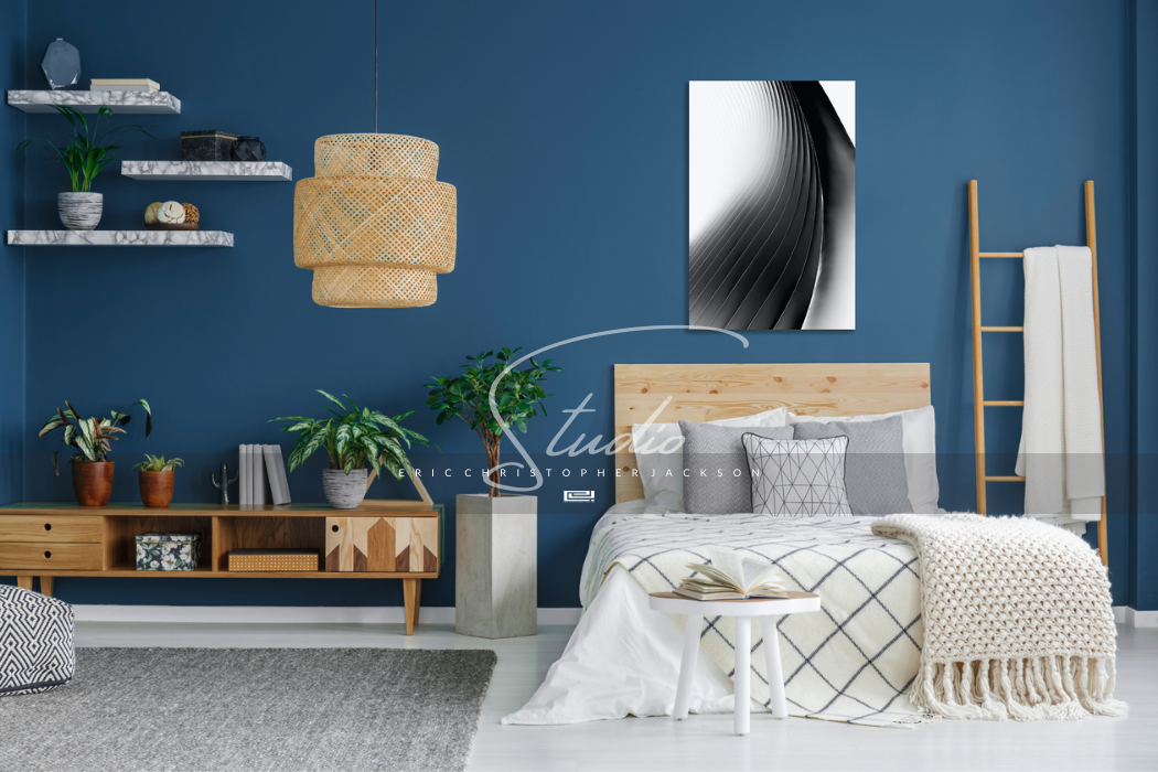
Oculus (2019) | Limited Edition
Series, New York City
Hello,
One thing that I'm focused on with the new direction for the Studio is adding Color. Not necessarily a Color to my Work, but Color around it. The interior selected for Oculus is a perfect example. The Photograph is a rather high-key, black and white scene. The blue Color of the wall actually brings more life to this piece.

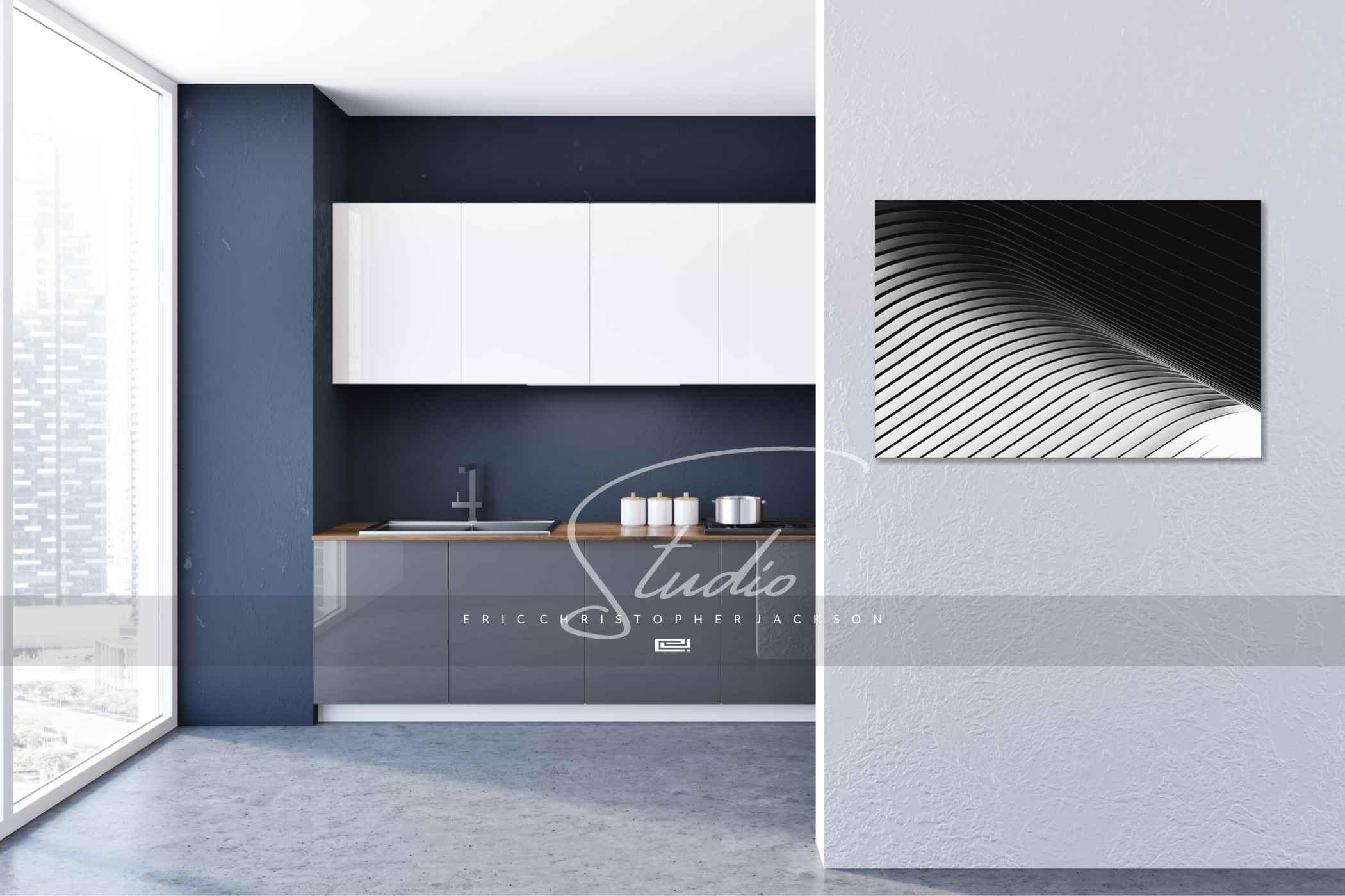
Inversion (2019) | Limited Edition
Series, New York City
Inversion was a bit tricky to find the right interior for. Very stark contrast between black and white. High-key Lighting on one side to extremely dark shadows right next to it. Not every piece will fit well in every Space. The artwork and interior have to compliment each other.
This shade of purple with a neutral grey surprised me with how well they work together. Even more surprising, Inversion fits into the space perfectly. This is why I need to add more interiors to the Studio presentations. It is much easier for Art Collectors to judge if a piece is right for their Space or not.

Water, No.10 (2019)
Series, Water
The blue Color in Photographs from the Series, Water, is bold. Which means, it can easily overwhelm a Space. If the piece is too bold, it takes over a room. If it is too passive, you may not notice the piece is on the wall.
Typically, if the wall is not white, I like to add a B/W piece to the room. However, that did not work for this interior. With three predominant Colors, the B/Ws were getting lost. I needed a piece that stood out and blended well with the room Colors.
The subtle lighting in Water, No.10 combined with how the blue matches with the wall paint, wood floor, and sofa made this a clear choice for me. In other words, I added a piece that didn't throw off the balance of the room.
You can see more interiors like these as I finish them on the Studio's new Instagram page: @ericcjacksonstudio
Happy Saturday,
Eric C. Jackson
Written by Eric Christopher Jackson
%20%7C%20Limited%20EditionSeries,%20New%20York%20City%0AHello,%0AOne%20thing%20that%20I'm%20focused%20on%20with%20the%20new%20direction%20for%20the%20Studio%20is%20adding%20Color.%20Not%20necessarily%20a%20Color%20to%20my%20Work,%20but%20Color%20aroun...)
Leave a comment
This site is protected by hCaptcha and the hCaptcha Privacy Policy and Terms of Service apply.