


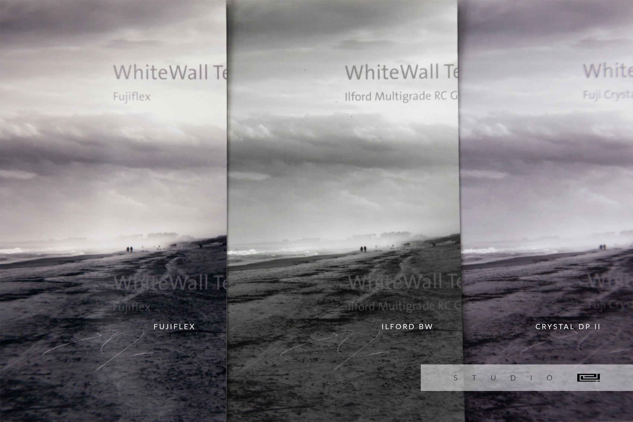
Base Color Tones for Black & White Prints

WARM | NEUTRAL | COOL
BASE COLOR TONES
Paper Comparisons
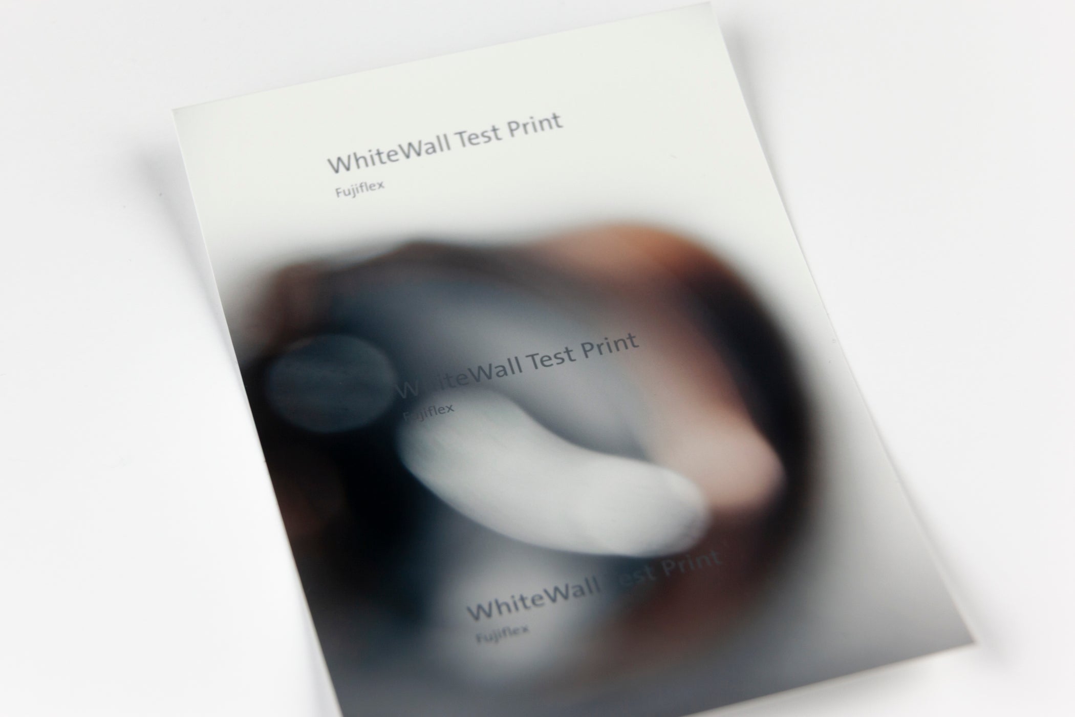
(Left) FujiFlex High Gloss Paper | Warm Base Color Tone
(Center) ILFORD BW Paper | Neutral Base Color Tone
(Right) Fuji Crystal DP II | Cool Base Color Tone
Featured:
WALK WITH ME
Series | Fernandina Beach
The new Delivery of Proofs for last week included the ILFORD BW Paper. I wanted to find an affordable Paper with Neutral Base Color Tone for my Black & White Photographs. While FujiFlex is still my favorite, it definitely leans Warm in Color Tone. The DP II is an inexpensive Paper Option. However, I feel it leans too Cool in Color Tone for my taste.
As expected, the Ilford BW Paper is perfectly Neutral, not leaning Warm or Cool. However, it does not work well for all of my Black & White Photographs. While the Ilford does an excellent job with Details in the Highlights, the Midtones are less defined because the Shadows are noticeably lifted, which blurs where Midtones end and Shadows begin.
Some Collectors will choose the Ilford BW Paper for this very reason. There is more Detail shown in the Shadows. Others may choose the DP II because they prefer a Cool Color Tone. I prefer the extra Moody, high Contrast Style of the FujiFlex.
Still, all three Samples will be presented in my Portfolio Case to let Collectors decide which Paper fits their Style the most.

%20FujiFlex%20High%20Gloss%20Paper%20%7C%20Warm%20Base%20Color%20Tone(Center)%20ILFORD%20BW%20Paper%20%7C%20Neutral%20Base%20Color%20Tone(Right)%20Fuji%20Crystal%20DP%20II%20%7C%20Co...)
Leave a comment
This site is protected by hCaptcha and the hCaptcha Privacy Policy and Terms of Service apply.